Pages

Tuesday, March 19, 2013

Creating Dimension


First I adjusted the levels on the background layer. Then I found a rock shape I liked, selected it, contracted it by 2 pixels, copy/pasted into the rock image that I liked (the one above), saved the selection and discarded the original rock layer. I then copy/pasted that rock using the selection from the other rock and copy/pasted that on top of my background layer. Or you can just select a shape you like using the selection tool.

I then adjusted the levels on the new Rock Layer. The colors on the bottom tip were too yellow and looked odd so I selected the area, copy/pasted it to a new layer and adjusted its levels. I then Merged Down (Ctrl + E or use Layers Menu) all the way to the Rock Layer. I locked the Rock Layer.

 I loaded the Rock's selection and pressed Ctrl + H to hide the marching ants. Then I began to shade the rock. I chose ground, plant (near bottom) and sky colors (near top). I set the Modes to Multiply and adjusted Opacity (on your Layers Menu). I then made a small shadow for the rock on the ground using a selection with a 3 pixel feather.  I merged all the Shading into one layer once I was satisfied. You can then click the layer on and off to see the difference.

Rock - http://letsjapan.wordpress.com/galleries-photo-essays/images-from-india/
Death Valley - http://commons.wikimedia.org/wiki/File:Death_Valley,19820816,Desert,incoming_near_Shoshones.jpg

Wednesday, March 13, 2013

Magic


Milk - http://4t0m1c-w07f.deviantart.com/art/Milk1-208801744
Woman - http://meltys-stock.deviantart.com/art/sorcerer-5-112721795

This is a fairly simply manipulation. Take your milk splash into Select - Color Range and Eyedropper + all the black area then click ok. Then Inverse the selection and copy/paste it onto your main image. Edit - Transform - Scale to the size you want. Erase what you don't want. Then add color. Use Photo Filter (under Image - Adjustments) and go with the Warm Filer. Then go to Layers - Layer Styles - Inner Shadow and make the adjustments. Then click on Gradient Overlay and make those adjustments. You'll want to experiment with them. But Overlay for Inner Shadow and Linear Burn for Gradient Overlay work pretty good. I also added a small Outer Glow to some of the spots under her hand.

Thursday, February 21, 2013

How to Turn a Masterpiece into a LOL

I made a selection of David's face and copy/pasted it onto Young Lady In A Boat. I scaled it down while next to the girl's face for comparison. In this case it was important for the eyes and the chin to line up. I put his layer over her face and then the fun began. Lots of fiddling around with getting the coloring as close to hers as I could. I used a mask for some of it, especially around the edges and the hair hanging in her face. I did some outright painting on David's face and some on the girl's hand which is in the top layer - touch ups. I painted over, at a low opacity, David's eyebrows with her hair color and his mouth with the color of her mouth. I picked up colors with the eyedropper from the girl's face. I did not use the selection I made of the girl's hair that you can see in the Layers palette.
After I was done, I pushed the greys/middle triangle towards the white in Levels.

Wednesday, February 20, 2013

Making Something Pop


Find an image you want to work with and create a blank layer above it. In that layer, using black, paint the area you want to "pop". In this case it was the cat's eyes and nose. Deselect the "eye" on the original image layer. Make sure your top layer with blacked out area is active. Choose Edit, Define Pattern. Make a copy of your color layer and create a New document with it. Convert the color image in the new document to Grayscale (Image, Mode) then to Bitmap (Image, Mode, Bitmap) choosing Custom Pattern for the Method. Use pattern you just made. Convert back to Grayscale.

Copy grayscale image and paste it into original document over the color image. Choose the Overlay blending mode at the top of the Layers palette. Experiment with Opacity. Make sure Eye on blacked out layer is off.

Wednesday, February 6, 2013

Dragon Dreams


 http://silinias.deviantart.com/art/Dragon-Skull-02-33180017
http://catstock.deviantart.com/art/Little-Serpent-Dragon-34-313629519
http://empty-dreams.deviantart.com/art/Parchment-38523655
http://exchanged-stock.deviantart.com/art/Embellished-71418695
http://tetramegistus.deviantart.com/art/Paleografia-I-161038127
Dragon in center from a tatoo
http://browse.deviantart.com/?qh=&section=&global=1&q=3headcat#/d5g37zr
Font is Monk and Latin Unical

I used a Hard Light Mode on the Smoke layers. Sometimes it's easier to adjust Exposure or Vibrancy or Contrast after you've finished everything else. This looked pretty good but I decided to make a jpeg so that I'd have a flat copy to play with the Exposure for the overall image.

Tuesday, January 22, 2013

Wood Nymph 1


 I've included a link to the tutorial I used to help me create this image. I veered off on my own a little but it's always fun to experiment! For me with this image it was easier to use the eraser rather than a Layer Mask. I didn't want cracks on her fingers. I took the image of the peeling tree into Camera Raw made it more pink rather than the natural orange that was inside the tree.

http://misssouls-stock.deviantart.com/art/Back-1-166524593 
http://humblebeez.deviantart.com/art/cracks-1-184649938
http://elvenred.deviantart.com/art/Peeling-114334939
http://kuschelirmel-stock.deviantart.com/art/Crack-and-Peel-157854964?moodonly=1#comments

Thursday, January 17, 2013

Depths of Blue

I painted over the mermaid rather than using filters in order to make her more like a painting. The background is a composite of  2 gradients, a photo of some sand, some fish (I erased most of their background) and the sea life near the left bottom corner which lost their color in order to get them merge properly so I added color on three layers for them. I used the oil paint filter before I added fish and sea life.
Layer 2 and Layer 2 copy are the fish. I hadn't named them yet.

Originally, I was working with the type and then it turned into a bigger project than I had planned.

http://mjranum-stock.deviantart.com/art/Goldfish-2-53812663


Tuesday, January 15, 2013

Dark Dream

More experimenting. Trying to intensify mood.

Moods


http://empatia-stock.deviantart.com/art/casual-porcelain2-106233881
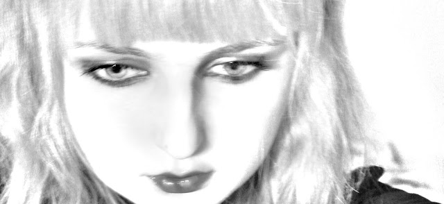
Experiment with modes, opacity and colors. Black and white was created with desaturation. The Gaussian Blur is on a duplicate of black and white image. I moved the gray slider (middle) in Levels towards my left, to bring up more white.

Monday, January 14, 2013

Aaron Swartz, Internet Hero

R.I.P, Aaron Swartz
The posts are rampant still the web is dark today.

Thursday, January 10, 2013

Read The Sign

http://browse.deviantart.com/resources/stockart/model/men/?order=24&q=people#/drgnoj
http://browse.deviantart.com/?q=UFO+sign#/d15ediv

Layer 2 at the top is my Displacement map.
Layer 3 and it's copy are the same shadow, intensified.
The Background Copy  is Overlay mode.
Layer 1 Copy has a Soft Light mode.

Displacement


http://www.youtube.com/watch?v=jPsjpj4Euww&list=UUDfJlseFwUx2X0h3m5PRILA&index=2
http://the-real-me-inside.deviantart.com/art/scream-55703914